dashNEWS
Focus on CONCEPT INNOVATION, FRONT-END DEVELOPMENT, and VISUAL DESIGN skills
DESIGNERS: 1 | TIMELINE: 2 weeks | PLATFORM: Desktop (responsive) | TOOLS: Sketchbook & Pen, Sketch, Atom
THE CLIENT
The goal of my fourth UXDI project with General Assembly was to design and then code a single-page promotional website for a classmate’s app concept using HTML and CSS.
My classmate’s concept was for a news application called “Breaker”, which she originally designed to help “heavy consumers of news” customize the type and frequency of their notifications related to breaking news events.
In addition to the goal of designing a one-page promotional website to advertise the application as a product, the app’s original designer (my classmate) challenged me to fundamentally redesign the product into something more innovative and engaging.
THE OPPORTUNITY
Heavy consumers of news can feel inundated with notifications about breaking news stories and updates, many of which don't particularly interest them.
Beyond that, the problem of “fake news” and “alternative facts” is inescapable when considering news content in the context of today's world.
Digitally prioritizing factual information could be an effective start to solving this problem while simultaneously streamlining the delivery of accurate, useful content to heavy news consumers.
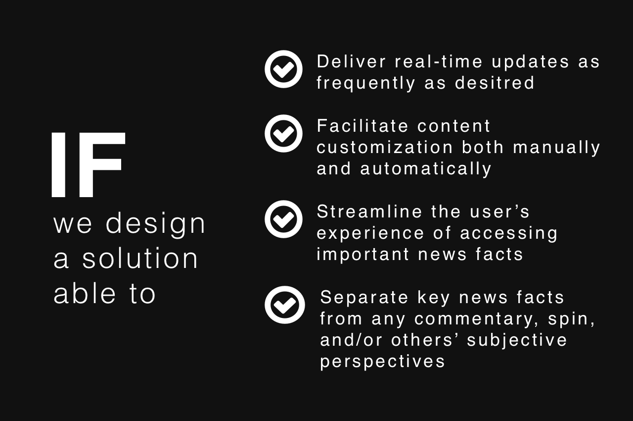
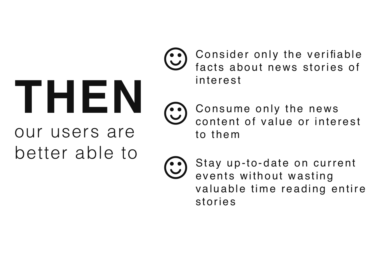
THE HYPOTHESIZED SOLUTION
MY ROLE
- UX DESIGNER responsible for the product's concept development as well as its visual design elements, including a style tile and hi-fidelity wireframe of the product's promotional website design
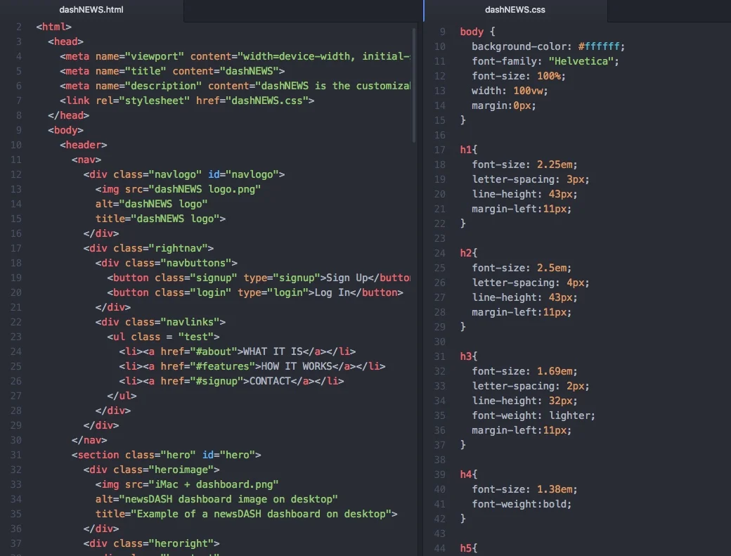
- FRONT END DEVELOPER responsible for coding the single-page promotional site for structure (HTML) and presentation (CSS)
CONCEPT DEVELOPMENT PROCESS
Through preliminary internet research, I realized that leveraging artificial intelligence as a core technology could take the concept of curated news notifications to the next level in terms of the product’s usability and uniqueness.
I discovered that the Associated Press offers a variety of data formats for the news information they handle and identified them as the non-profit organization through which many of the mainstream media outlets source their stories.
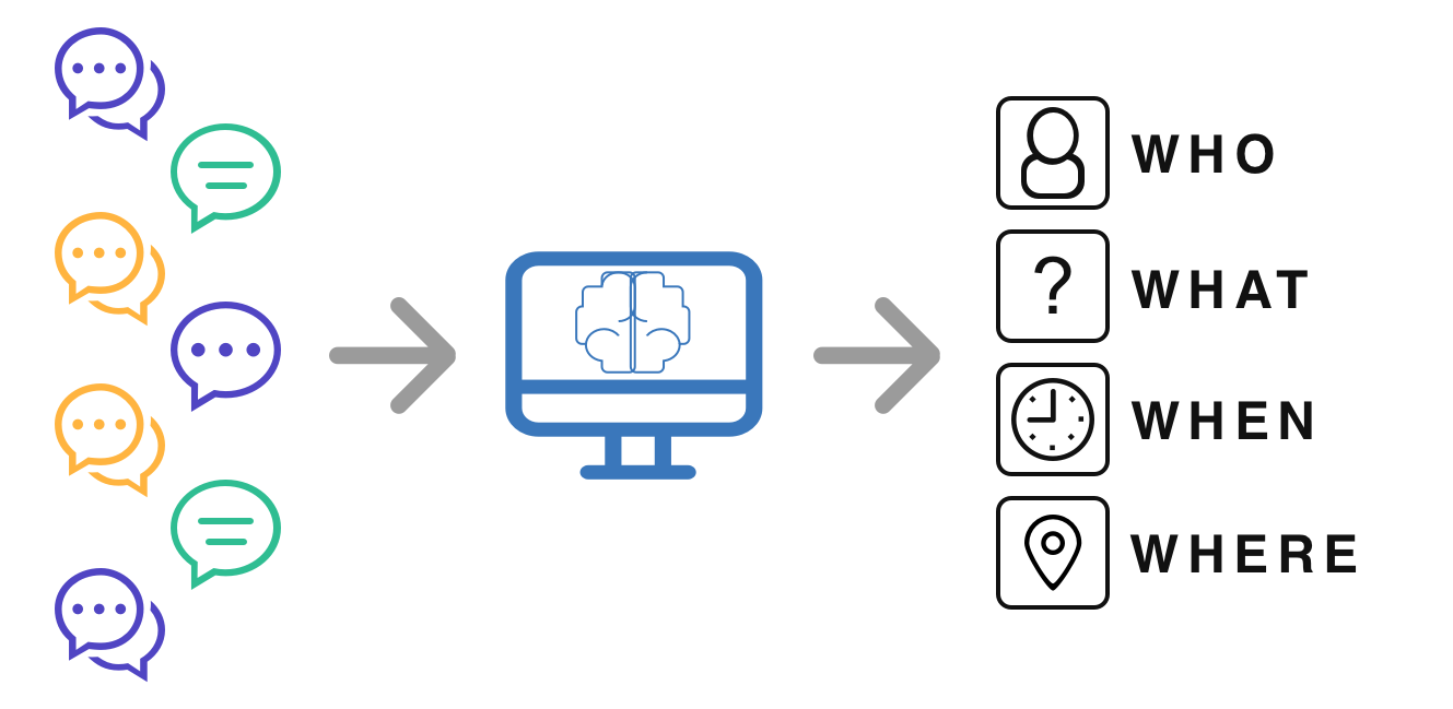
Inspired by this research, I began ideating a solution around the concept of separating the core facts of a news story - WHO, WHAT, WHEN and WHERE - from any biased narratives crafted by journalists or other content creators around those core facts.
My goal was to design a solution that gave users personal freedom to directly access basic facts related to the news they care about in a single glance, free from bias, along with the ability to “drill-down” on a topic and access more detailed information about that particular piece of news.
KEY PRODUCT INSIGHTS
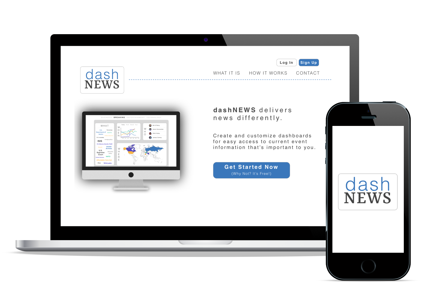
Naming the product “dashNEWS” was intended to clearly communicate that the product is an app designed to efficiently deliver news-content to users in a dashboard-style format.
The unconventional capitalizations used in the name is designed as a visual embodiment of the product's uniqueness compared to competing news apps.
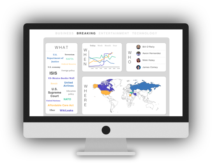
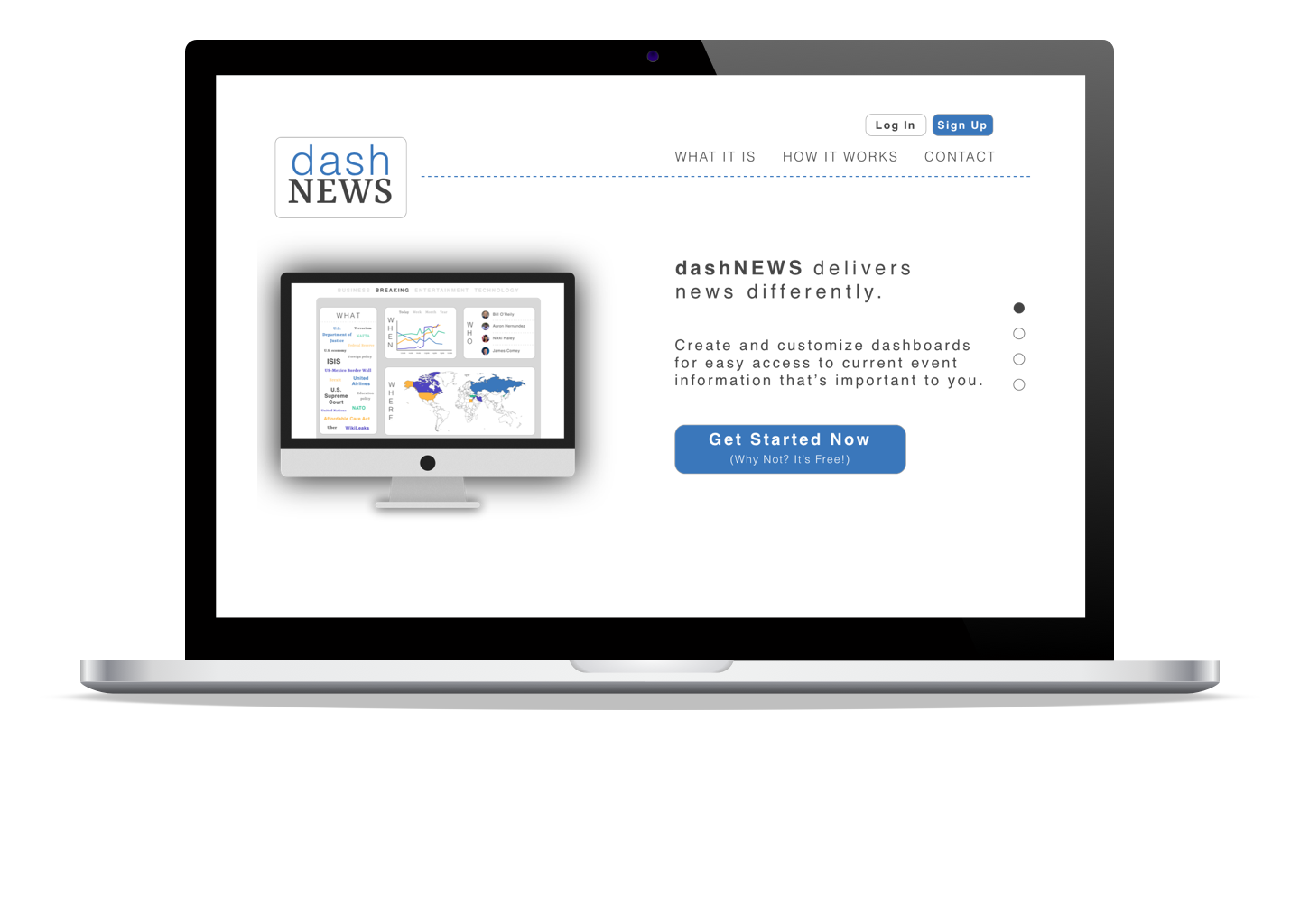
I chose a dashboard-style UI for the product, relying on traditional analytics dashboards as the convention for presenting information-of-value in an easy-to-digest and easy-to-customize format.
By presenting the most frequently-covered people, places, times, and topics at any given moment, each user can have the individual freedom to remove the pieces of information they find less interesting or relevant by simply dragging-and-dropping those elements outside of the dashboard.
By leveraging artificial intelligence as its core technology, dashNEWS can learn which pieces of information to display on each user’s unique dashboard over time.
Learning from users' unique interactions with news data on the dashboard would empower dashNEWS to automatically and effectively curate content based on each user's specific interests and behavior.
VISUAL DESIGN ELEMENTS
The visual brand identity for dashNEWS was fundamentally designed to communicate practicality, transparency, and a focus on relevant facts & figures.
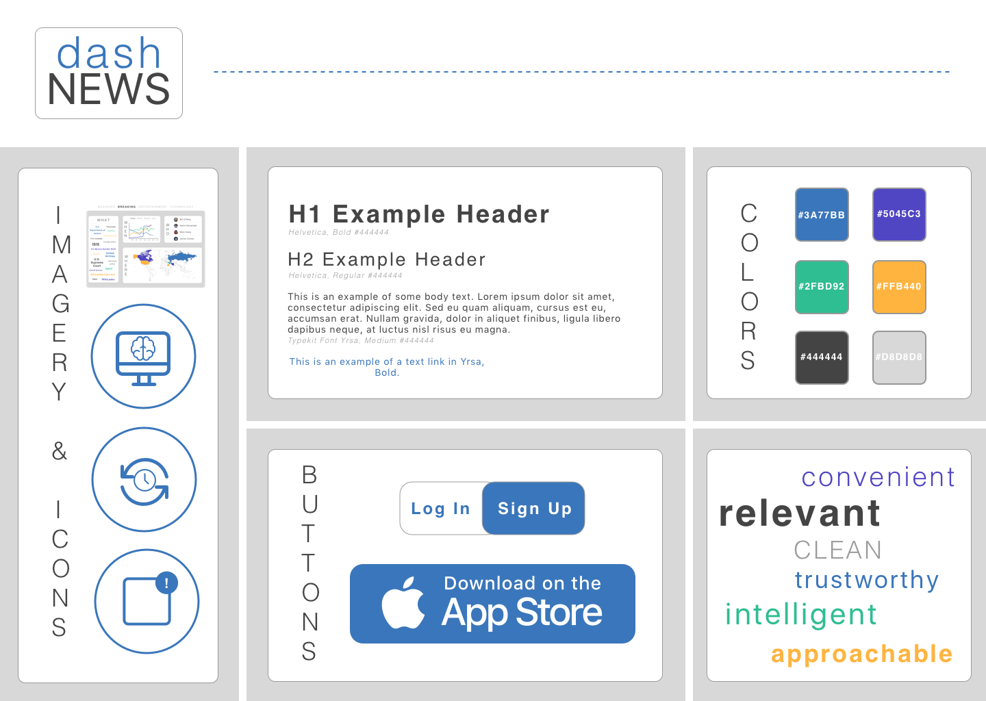
I designed a style tile to encapsulate and organize visual elements of the site. Each element was selected to represent dashNEWS as a logical, intelligent news aggregator whose clean, modern approach to delivering relevant information is a refreshing and approachable experience for users.
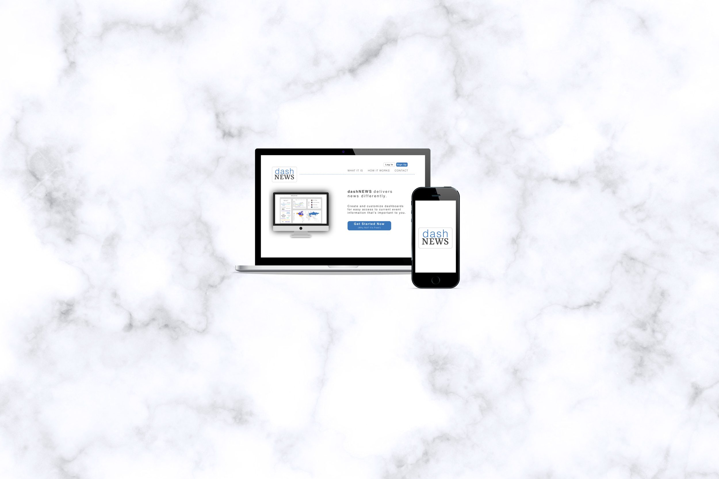
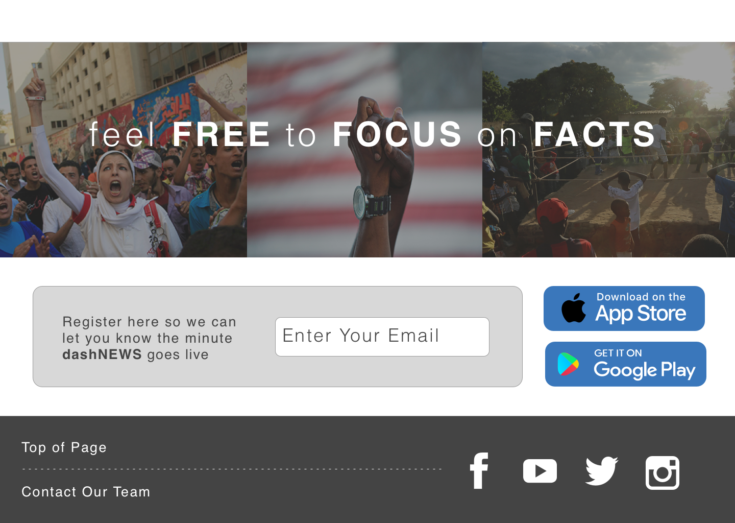
The dashNEWS landing page was specifically designed to communicate trustworthiness, convenience, modernity, and customizability.
This is accomplished by the use of clear icons, compelling imagery, an effective color palette, and consistent typography.
FRONT-END DEVELOPMENT
After both conceptualizing the product and then designing a one-page promotional website for dashNEWS, I wrote all of the HTML and CSS code for the website as an exercise in empathizing with web developers.
NEXT STEPS
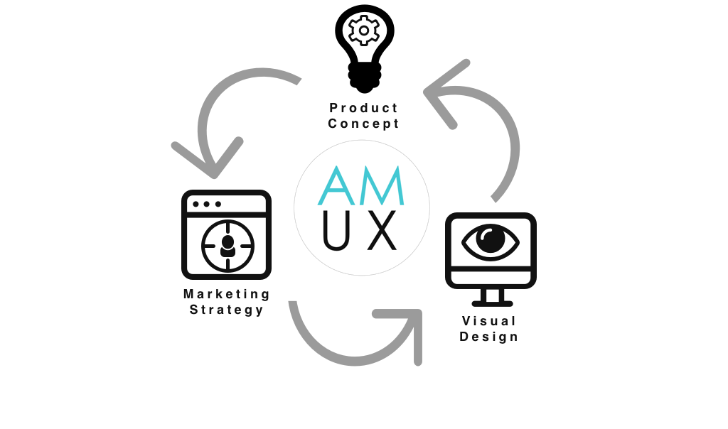
Moving forward, I plan to continue work on dashNEWS by iteratively refining its:
- Product Concept
- Marketing Strategy
- Visual Design
I plan to use the results of continued research and user testing to inform future design changes and product iterations.
